Class 9 Maths Ganita Manjari Chapter 10 End of Chapter Exercises How Quantities Combine: Understanding Data
Looking for Class 9 Maths Ganita Manjari Chapter 10 End of Chapter Exercises Solutions? This page provides clear and step-by-step solutions for Chapter 10 – How Quantities Combine: Understanding Data, Part 2. These solutions help students revise the complete chapter, strengthen their understanding of important concepts, and practise different types of questions given at the end of the chapter.
Students can use the Ganita Manjari Class 9 Maths Chapter 10 End of Chapter Exercises Solutions for homework, revision, and exam preparation. A PDF of the complete End of Chapter Exercises solutions is also available for easy reference and offline study.
NCERT Class 9 Maths Ganita Manjari Chapter 10 End-of-Chapter Exercises
1. In cricket, the run rate is the average number of runs scored per over. In a T20 match, a team scored 6 runs in the first over making the run rate 6.
(i) In the second over they scored 12 runs. What is the run rate now?
(ii) After Over 19, their run rate was 6. What is the run rate after 20 overs given the team made 12 runs in the last over?
Solution:
Run rate is calculated as:
Run rate = Total runs scored ÷ Total overs played
(i) Run rate after the second over
Runs scored in the first over = 6
Runs scored in the second over = 12
Total runs after 2 overs:
6 + 12 = 18
Run rate:
18 ÷ 2 = 9
Therefore, the run rate after 2 overs is 9 runs per over.
(ii) Run rate after 20 overs
Run rate after 19 overs = 6
So, total runs after 19 overs:
19 × 6 = 114
Runs scored in the 20th over = 12
Total runs after 20 overs:
114 + 12 = 126
Run rate after 20 overs:
126 ÷ 20 = 6.3
Therefore, the run rate after 20 overs is 6.3 runs per over.
2. Five friends who play badminton surveyed the city and collected the price of shuttlecocks across brands and types (Nylon and Feather). The following is the list of the prices, in rupees (₹), that each one compiled.

- Yusuf: 40(N), 105(N), 383(F), 108(N), 165(F), 116(F)
- Srikanth: 194(N), 85(N), 93(N), 121(N)
- Kashvi: 49(N), 297(F), 105(N), 275(F), 40(N)
- Prasanna: 124(N), 333(F), 182(N), 258(F)
- Gracy: 220(F), 458(F), 129(F), 183(N)
Can you describe a way they can work together to find the average price of a shuttlecock across types?
(i) Each one calculated the average of the prices they had gathered. Suppose these are a_y, a_s, a_k, a_p, a_g respectively. Write an expression that gives the combined average.
(ii) Suppose a_n, a_f are the average prices of the nylon shuttlecocks and the feather shuttlecocks, respectively. Write an expression that gives the average price of a shuttlecock. Will this be equal to the answer we got using the method in the previous part?
Answer:
Solution:
To find the average price of a shuttlecock across both types, the five friends can each find the total price and number of shuttlecocks in their list. They can then add all the totals and divide by the total number of shuttlecocks collected.
The numbers of prices collected are:
- Yusuf: 6
- Srikanth: 4
- Kashvi: 5
- Prasanna: 4
- Gracy: 4
Total number of shuttlecocks = 6 + 4 + 5 + 4 + 4 = 23
(i) Expression for the combined average
Let their individual averages be a_y, a_s, a_k, a_p and a_g.
Since they collected different numbers of prices, we must use a weighted average:
Combined average = (6a_y + 4a_s + 5a_k + 4a_p + 4a_g) / 23
Therefore,
Answer: (6a_y + 4a_s + 5a_k + 4a_p + 4a_g) / 23
Using the actual data, the total of all prices is ₹4063.
So,
Average price = 4063 / 23
≈ ₹176.65
(ii) Expression using nylon and feather shuttlecocks
First count the shuttlecocks of each type.
Number of nylon shuttlecocks = 13
Number of feather shuttlecocks = 10
Let:
a_n = average price of nylon shuttlecocks
a_f = average price of feather shuttlecocks
Then,
Average price = (13a_n + 10a_f) / 23
For the given data:
Average price of nylon shuttlecocks
= 1429 / 13
≈ ₹109.92
Average price of feather shuttlecocks
= 2634 / 10
= ₹263.40
Therefore,
Average price
= (13 × 109.92 + 10 × 263.40) / 23
≈ ₹176.65
Yes, this is equal to the answer obtained in part (i). Both methods use the same 23 prices; they simply group the data differently.
3. Shreyas holds 25 shares of a company at an average price of ₹150 and Vaishnavi holds 5 shares of the same company at an average price of ₹150.
(i) Shreyas buys 10 shares of this company at a price of ₹30 each. What is the average price per share for him after the purchase?
(ii) Vaishnavi buys some shares of this company at a price of ₹30 each and the average price per share for her after the purchase is ₹70. How many shares did she buy?
Answer:
Solution:
(i) Shreyas
Shreyas initially has 25 shares at an average price of ₹150.
Total initial cost:
25 × 150 = ₹3750
He buys 10 more shares at ₹30 each:
10 × 30 = ₹300
Total cost after purchase:
₹3750 + ₹300 = ₹4050
Total number of shares:
25 + 10 = 35
New average price per share:
4050 ÷ 35 = ₹115.71 approximately
Therefore, Shreyas’s new average price per share is approximately ₹115.71.
(ii) Vaishnavi
Vaishnavi initially has 5 shares at an average price of ₹150.
Initial total cost:
5 × 150 = ₹750
Let the number of shares she buys at ₹30 each be x.
Her new average price is ₹70, so:
(750 + 30x) / (5 + x) = 70
750 + 30x = 350 + 70x
400 = 40x
x = 10
Therefore, Vaishnavi bought 10 shares.
4. (Pṛthūdakasvāmī, commentary on Brahmagupta’s Brāhmasphuṭasiddhānta, c. 864 CE) A “hasta” (meaning “forearm”) refers to a unit of length measuring around 18 inches. A pool 30 hastas long is dug to different depths along its length. It is divided into 5 sections having lengths 4, 5, 6, 7, and 8 hastas, and is dug to depths of 9, 7, 7, 3, and 2 hastas, respectively. Find the mean depth of the pool.
Answer:
Since the pool has different depths over sections of different lengths, we use a weighted average.
Lengths of the sections = 4, 5, 6, 7, 8 hastas
Corresponding depths = 9, 7, 7, 3, 2 hastas
Mean depth:
Mean depth = (4 × 9 + 5 × 7 + 6 × 7 + 7 × 3 + 8 × 2) / (4 + 5 + 6 + 7 + 8)
= (36 + 35 + 42 + 21 + 16) / 30
= 150 / 30
= 5 hastas
Therefore, the mean depth of the pool is 5 hastas.
5. Suvarna had purchased 1g gold at ₹15k (short for ₹15,000). This is shown by point O denoting the average price of gold that she possesses. Six different scenarios are given below for her next transaction. For each scenario estimate and mark the average price of gold she will have after the transaction.

(i) Purchase 1g gold at ₹30k
(ii) Purchase 2g gold at ₹30k
(iii) Purchase 1g gold at ₹10k
(iv) Purchase 10g gold at ₹10k
(v) Purchase 0.5g gold at ₹30k
(vi) Purchase 0.5g gold at ₹15k
Answer:
Suvarna initially has 1 g of gold at an average price of ₹15k per gram.
For each transaction:
New average price = Total amount spent ÷ Total quantity of gold
(i) Purchase 1 g gold at ₹30k
Total cost = 15 + 30 = ₹45k
Total gold = 1 + 1 = 2 g
Average price = 45 ÷ 2 = ₹22.5k per g
So, mark the point at 22.5.
(ii) Purchase 2 g gold at ₹30k per g
Cost of new gold = 2 × 30 = ₹60k
Total cost = 15 + 60 = ₹75k
Total gold = 1 + 2 = 3 g
Average price = 75 ÷ 3 = ₹25k per g
So, mark the point at 25.
(iii) Purchase 1 g gold at ₹10k
Total cost = 15 + 10 = ₹25k
Total gold = 2 g
Average price = 25 ÷ 2 = ₹12.5k per g
So, mark the point at 12.5.
(iv) Purchase 10 g gold at ₹10k per g
Cost of new gold = 10 × 10 = ₹100k
Total cost = 15 + 100 = ₹115k
Total gold = 1 + 10 = 11 g
Average price = 115 ÷ 11 ≈ ₹10.45k per g
So, mark the point slightly above 10.
(v) Purchase 0.5 g gold at ₹30k per g
Cost of new gold = 0.5 × 30 = ₹15k
Total cost = 15 + 15 = ₹30k
Total gold = 1 + 0.5 = 1.5 g
Average price = 30 ÷ 1.5 = ₹20k per g
So, mark the point at 20.
(vi) Purchase 0.5 g gold at ₹15k per g
Cost of new gold = 0.5 × 15 = ₹7.5k
Total cost = 15 + 7.5 = ₹22.5k
Total gold = 1.5 g
Average price = 22.5 ÷ 1.5 = ₹15k per g
So, the average remains at 15.
Final answers:
(i) ₹22.5k
(ii) ₹25k
(iii) ₹12.5k
(iv) ₹10.45k approximately
(v) ₹20k
(vi) ₹15k
6. Given some data with corresponding weights, how would the weighted average change if all the weights are doubled? If required, experiment with some data. What do you observe? Justify your answer using algebra.
Answer:
The weighted average does not change if all the weights are doubled.
Suppose the data values are x₁, x₂, ..., xₙ with corresponding weights w₁, w₂, ..., wₙ.
The weighted average is:
Weighted average = (x₁w₁ + x₂w₂ + ... + xₙwₙ) / (w₁ + w₂ + ... + wₙ)
If all the weights are doubled, the new weighted average becomes:
[x₁(2w₁) + x₂(2w₂) + ... + xₙ(2wₙ)] / (2w₁ + 2w₂ + ... + 2wₙ)
Taking 2 common from the numerator and denominator:
= 2(x₁w₁ + x₂w₂ + ... + xₙwₙ) / 2(w₁ + w₂ + ... + wₙ)
The 2 cancels out, giving:
(x₁w₁ + x₂w₂ + ... + xₙwₙ) / (w₁ + w₂ + ... + wₙ)
This is the original weighted average.
Therefore, doubling all the weights does not change the weighted average. In fact, multiplying all weights by the same non-zero number leaves the weighted average unchanged.
7. Answer the following questions based on the graph.
(i) In 2003, approximately how many total objects were found orbiting Earth in space? In what year did this number double?
(ii) Find the approximate number and share of payload objects and other objects in the year 2025.
(iii) What can you say about the number of payload objects over time, and the number of other objects over time? What can you say about the share of payload objects over time, and the share of other objects over time?

Answer:
(i) Total objects in 2003 and when this number doubled
From the graph, in 2003 there were approximately 9,500 objects orbiting Earth.
Double of 9,500 is approximately:
9,500 × 2 = 19,000
The total number of objects reaches about 19,000 in 2019.
Therefore, there were about 9,500 objects in 2003, and this number approximately doubled by 2019.
(ii) Number and share of payload and other objects in 2025
From the 2025 bar:
- Total objects ≈ 35,000
- Payload objects ≈ 16,500–17,000
- Other objects ≈ 18,000
Approximate share of payload objects:
(16,500 / 35,000) × 100 ≈ 47%–48%
Approximate share of other objects:
(18,000 / 35,000) × 100 ≈ 52%–53%
Therefore, in 2025, roughly 48% were payload objects and 52% were other objects.
(iii) What trends can be observed?
The number of both payload objects and other objects has increased over time.
For many years, the number of payload objects increased gradually, but it has risen very sharply in recent years. The number of other objects has also increased steadily over time.
In terms of their shares, other objects formed a much larger share of the total for many years. However, the share of payload objects has increased considerably in recent years. By 2025, the two categories account for nearly equal shares, with other objects still slightly higher.
8. Observe the following infographic.

(i) Identify the correct inference(s) from the statements given.
(a) More schools have a playground in Haryana compared to Uttarakhand.
(b) Approximately every 2 out of 3 schools in Arunachal Pradesh have a playground.
(c) Punjab has the highest number of schools with a playground.
(d) Suppose it is given that Maharashtra has more schools than Telangana. Then the number of schools having a playground is more in Maharashtra.
(ii) Using the information given, can we find the nation-wide percentage of schools with a playground? If not, what additional information is needed?
Answer:
(i) Identify the correct inference(s)
(a) More schools have a playground in Haryana compared to Uttarakhand.
Haryana: 90%
Uttarakhand: 78%
Although Haryana has a higher percentage, the infographic does not tell us the total number of schools in each state. Therefore, we cannot conclude that the number of schools with playgrounds is higher in Haryana.
So, (a) cannot be inferred.
(b) Approximately every 2 out of 3 schools in Arunachal Pradesh have a playground.
Arunachal Pradesh: 68%
2 out of 3 = 2/3 × 100 ≈ 66.7%
This is close to 68%.
So, (b) is correct.
(c) Punjab has the highest number of schools with a playground.
Punjab has 98% of schools with playgrounds, but this tells us only the percentage, not the actual number of schools.
So, (c) cannot be inferred.
(d) Suppose Maharashtra has more schools than Telangana. Then the number of schools having a playground is more in Maharashtra.
Maharashtra: 93%
Telangana: 74%
If Maharashtra also has more total schools than Telangana, and a higher percentage of them have playgrounds, then Maharashtra must have a greater number of schools with playgrounds.
So, (d) is correct.
Therefore, the correct inferences are (b) and (d).
(ii) Can we find the nationwide percentage?
No. The nationwide percentage cannot be found from the percentages alone because different states and Union Territories have different numbers of schools.
We would additionally need the total number of schools in each state/UT. Then we could calculate the number of schools with playgrounds in each region and find:
Nationwide percentage = (Total schools with playgrounds across India / Total schools across India) × 100
Thus, the number of schools in each state and Union Territory is the additional information required.
9. Decision Dilemma:
(i) Which of the plays would you choose to watch based on the following chart?.

(ii) The corresponding stacked bar chart is shown below. Would you change your decision after looking at this chart? Why/Why not? Discuss.
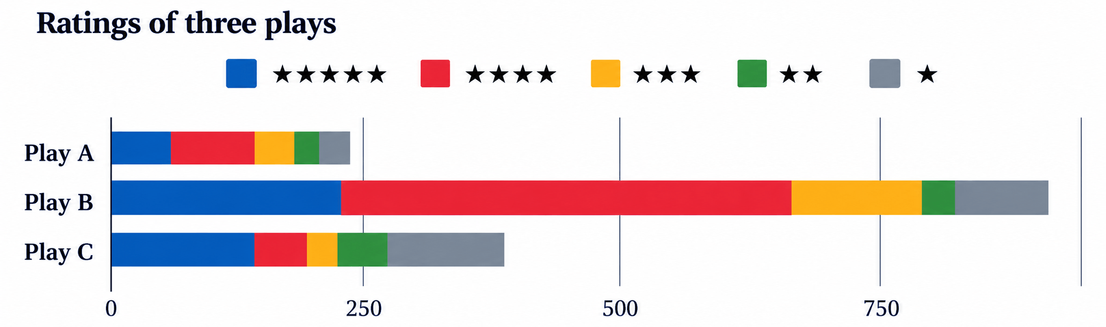
i) Which play would you choose based on the first chart?
The first chart shows the percentage distribution of ratings for each play.
A reasonable choice would be Play A, because a large proportion of its ratings are 4-star and 5-star, while comparatively few are 1-star or 2-star ratings.
Play B also has a very similar proportion of favourable ratings, whereas Play C has a noticeably larger share of low ratings.
Therefore, based only on the percentage distribution, Play A could be chosen.
(ii) Would you change your decision after looking at the second chart?
Possibly, yes. The second chart shows the actual number of ratings, not just their percentages.
It shows that Play B has received far more ratings than Play A, while still having a high proportion of 4-star and 5-star ratings. Hence, one may prefer Play B, because its rating pattern is based on a much larger number of viewers.
The two charts highlight different information:
- The 100% stacked bar chart compares the proportion of each type of rating.
- The stacked bar chart also shows the total number of ratings received by each play.
Thus, after considering both the quality and the number of ratings, one may change the choice from Play A to Play B. However, the final choice can vary depending on whether one gives more importance to rating proportions or to the number of viewers who rated the play.
10. A triathlon is an endurance race consisting of swimming 3.8 km, cycling 180 km, and running 42.2 km. Athletes compete for the fastest overall time, completing each segment in that order. The following table shows the finish time of 3 athletes in each segment.
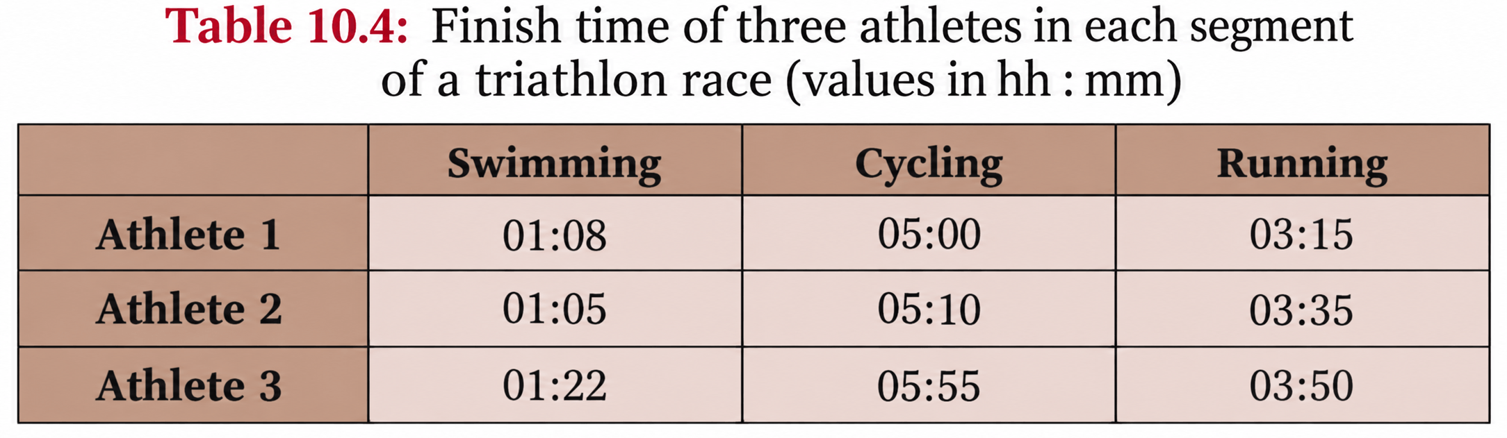
(i) What is a suitable representation of this data—a stacked bar chart or a 100% stacked bar chart? Why do you think so?
(ii) Suppose a 100% stacked bar chart is drawn. Which of the following question(s) can be answered by looking at just that chart?
(a) Who finished the race first?
(b) Approximately what fraction of their race time did Athlete 1 spend cycling?
(c) Which athlete took the longest for running?
Answer:
(i) Suitable representation
A stacked bar chart is more suitable.
This is because the total length of each bar represents the athlete’s total race time, while the individual sections show the time spent swimming, cycling, and running. This allows us to compare both the overall finishing times and the time spent on each segment.
A 100% stacked bar chart would make every athlete’s bar the same length, so the actual total race times could not be compared.
(ii) Questions that can be answered using only a 100% stacked bar chart
(a) Who finished the race first?
No. Since every bar is scaled to 100%, the total race times are not shown.
(b) Approximately what fraction of their race time did Athlete 1 spend cycling?
Yes. A 100% stacked bar chart shows what proportion of the total time was spent on each activity.
For Athlete 1:
Total time = 1 h 8 min + 5 h + 3 h 15 min
= 9 h 23 min = 563 min
Fraction spent cycling = 300/563 ≈ 53%
So, Athlete 1 spent a little over half of the total race time cycling.
(c) Which athlete took the longest for running?
No. The chart would show the proportion of each athlete’s total time spent running, not the actual running time.
Therefore, only question (b) can be answered from the 100% stacked bar chart.
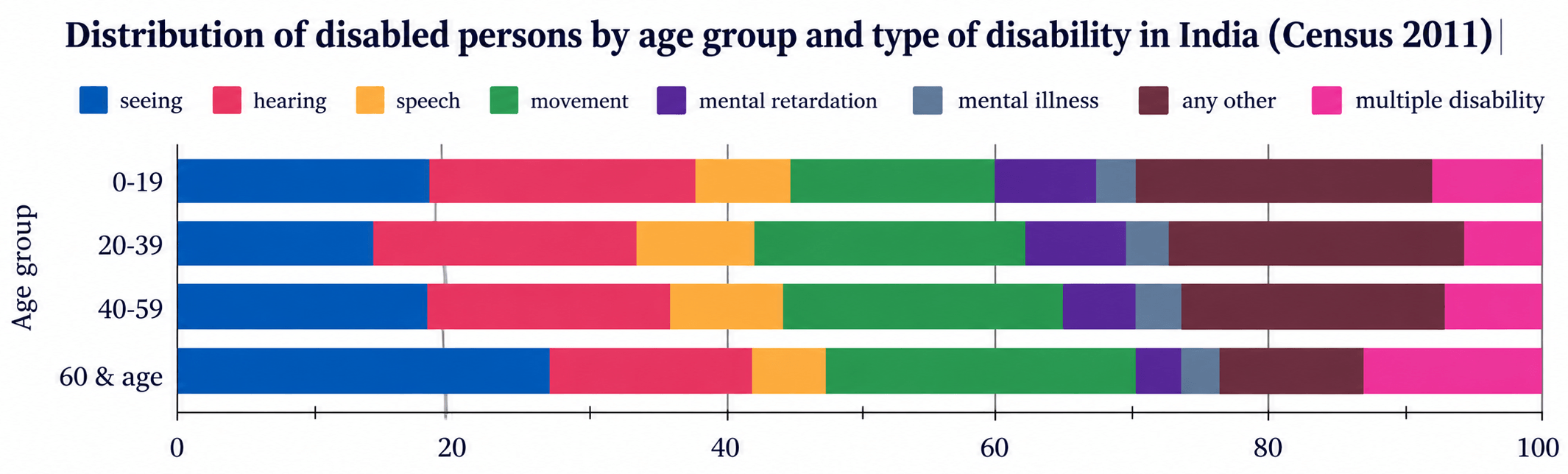
11. Look at the following graph. What do you notice? What do you wonder? Write your inferences.
Solution:
The graph is a 100% stacked bar chart showing how different types of disability are distributed within four age groups in India, according to Census 2011. Since every bar represents 100%, the graph compares proportions, not the actual number of persons.
Some observations and inferences are:
- Seeing-related disability forms a noticeably larger share in the 60 years and above age group than in the younger age groups.
- Movement-related disability also becomes more prominent in the older age groups.
- Hearing-related disability forms a fairly large share across all age groups, though its proportion is lower among those aged 60 and above than in some younger groups.
- Speech-related disability accounts for a relatively small share in every age group.
- The category labelled “mental retardation” in the Census 2011 graph (now generally referred to as intellectual disability) forms a larger share among younger age groups and a smaller share among older age groups.
- Multiple disability has a comparatively high share in the 60 years and above group.
- The category “any other” accounts for a substantial share among the younger and middle-age groups but is much smaller for those aged 60 and above.
What we may wonder
We may wonder why seeing, movement, and multiple disabilities form larger shares among older people, whether this is related to ageing, and whether the pattern has changed since the 2011 Census.
We may also want to know the actual number of persons in each age group. This graph alone cannot tell us that because it shows only percentages.
12. Individual project: Do at least one of the following.
(i) Recall the previous day and fill in the approximate time spent lying down, sitting, and standing/moving around, etc. Ask at least 2 of your family members about their day and fill it in. Alternatively, you can choose to track just your own body-state for any one of the weekdays, Saturday, and Sunday. Visualise it using a stacked bar chart. Discuss with your class how you arrived at the estimated time spent in each state.
(ii) Visualise your family’s monthly expenditure using a 100% stacked bar chart.
(a) First, identify the expense categories in your family budget.
(b) Discuss with your family members to decide how you will collect and organise the data.
(c) Collect expense data for at least 3 months.
(d) Represent the data in a 100% stacked bar chart, with each bar showing how the total monthly expenditure is divided across the different categories.
(e) Finally, write your observations and inferences based on the chart.
Answer:
Solution:
Since this is an individual project, the actual data will differ from person to person. The following can be used as a sample project.
(i) Time spent in different body-states
I estimated the time spent by myself and two family members during a typical day.
| Person | Lying down | Sitting | Standing/Moving | Total |
|---|---|---|---|---|
| Myself | 8 hours | 9 hours | 7 hours | 24 hours |
| Mother | 7.5 hours | 8.5 hours | 8 hours | 24 hours |
| Father | 7 hours | 10 hours | 7 hours | 24 hours |
A stacked bar chart can be drawn with one bar for each person. Each bar should extend from 0 to 24 hours and be divided into the three body-states.
I estimated the times by recalling sleeping hours, time spent studying or working while sitting, meal and travel time, and time spent walking, exercising or doing household activities.
Observations: My father spent the most time sitting, while my mother spent the most time standing or moving around. All three spent around 7–8 hours lying down. The stacked bar chart makes it easy to compare how each person's 24-hour day is divided.
Since this is an individual project, the actual expenditure will vary from family to family. The following is a sample project showing how it can be completed.
(a) Identify the expense categories
The monthly family expenditure can be divided into categories such as house rent, food and groceries, utilities, education, transport, and other expenses.
(b) Decide how to collect and organise the data
The expenditure data can be collected by discussing monthly spending with family members and referring to bills, receipts, bank statements, and digital payment records. The expenses can then be grouped under the selected categories and recorded month-wise in a table.
(c) Collect expense data for at least 3 months
Suppose the following expenditure was recorded:
| Expense category | January | February | March |
|---|---|---|---|
| House rent | ₹15,000 | ₹15,000 | ₹15,000 |
| Food & groceries | ₹12,000 | ₹14,000 | ₹13,000 |
| Utilities | ₹5,000 | ₹6,000 | ₹5,500 |
| Education | ₹8,000 | ₹10,000 | ₹9,000 |
| Transport | ₹5,000 | ₹6,000 | ₹5,500 |
| Other expenses | ₹5,000 | ₹9,000 | ₹7,000 |
| Total expenditure | ₹50,000 | ₹60,000 | ₹55,000 |
(d) Represent the data using a 100% stacked bar chart
To draw the 100% stacked bar chart, first convert every expense into a percentage of that month's total expenditure:
Percentage expenditure = (Amount spent on category / Total monthly expenditure) × 100
| Expense category | January | February | March |
|---|---|---|---|
| House rent | 30% | 25% | 27.27% |
| Food & groceries | 24% | 23.33% | 23.64% |
| Utilities | 10% | 10% | 10% |
| Education | 16% | 16.67% | 16.36% |
| Transport | 10% | 10% | 10% |
| Other expenses | 10% | 15% | 12.73% |
| Total | 100% | 100% | 100% |
100% stacked bar chart showing the share of each expense category over three months.

(e) Each bar represents 100% of the expenditure for one month, and the different sections show the proportion spent on each category.
13. Small-group project: Make a group of 3–4 students. Choose one scenario to design a custom rating scheme by assigning appropriate weights: (a) shopping experience at a cloth store, (b) travel experience in a bus, (c) tourism experience of a nearby tourist spot, (d) clinic/hospital experience
(i) Discuss and arrive at 4–6 aspects to rate. For each aspect chosen, justify why it matters for an overall experience.
(ii) Discuss and decide the relative weights and justify.
(iii) Collect or imagine ratings from at least 10 people on a scale of 1–5 (5 being very good).
(iv) Compute each individual rating. Compute the overall average across individuals.
(v) Make a 100% stacked bar chart using your data.
(vi) Write a short note on the observations and inferences, what your rating system captures well and what it misses.
Answer:
Small-Group Project: Clinic/Hospital Experience
For this sample project, we chose (d) Clinic/Hospital Experience.
(i) Aspects to rate and why they matter
We selected five aspects:
| Aspect | Why it matters |
|---|---|
| Doctor consultation | The quality of diagnosis, explanation and treatment is the most important part of the visit. |
| Staff behaviour | Polite and helpful staff improve the patient's overall experience. |
| Waiting time | Long waiting times can make the visit inconvenient and stressful. |
| Cleanliness | Hygiene is particularly important in a healthcare facility. |
| Facilities | Availability and quality of seating, washrooms, equipment and other facilities affect comfort and convenience. |
(ii) Relative weights
After discussion, we assigned the following weights:
| Aspect | Weight |
|---|---|
| Doctor consultation | 30% |
| Staff behaviour | 20% |
| Waiting time | 20% |
| Cleanliness | 15% |
| Facilities | 15% |
| Total | 100% |
We gave the highest weight to doctor consultation because medical care is the main purpose of visiting a clinic or hospital. Staff behaviour and waiting time were given the next-highest weights, while cleanliness and facilities were also considered important.
(iii) Ratings collected from 10 people
Ratings are on a scale of 1 to 5, where 5 means very good.
| Person | Doctor | Staff | Waiting time | Cleanliness | Facilities |
|---|---|---|---|---|---|
| 1 | 5 | 4 | 3 | 5 | 4 |
| 2 | 4 | 4 | 4 | 4 | 4 |
| 3 | 5 | 5 | 4 | 4 | 5 |
| 4 | 3 | 4 | 2 | 4 | 3 |
| 5 | 4 | 3 | 3 | 5 | 4 |
| 6 | 5 | 4 | 4 | 5 | 5 |
| 7 | 4 | 5 | 3 | 4 | 4 |
| 8 | 3 | 3 | 2 | 3 | 3 |
| 9 | 4 | 4 | 5 | 4 | 4 |
| 10 | 5 | 4 | 3 | 4 | 5 |
(iv) Individual ratings and overall average
The weighted rating is calculated as:
Individual rating = (30 × Doctor + 20 × Staff + 20 × Waiting + 15 × Cleanliness + 15 × Facilities) / 100
For Person 1:
= (30 × 5 + 20 × 4 + 20 × 3 + 15 × 5 + 15 × 4) / 100
= 425 / 100
= 4.25
Similarly:
| Person | Final weighted rating |
|---|---|
| 1 | 4.25 |
| 2 | 4.00 |
| 3 | 4.65 |
| 4 | 3.15 |
| 5 | 3.75 |
| 6 | 4.60 |
| 7 | 4.00 |
| 8 | 2.80 |
| 9 | 4.20 |
| 10 | 4.25 |
Overall average:
= (4.25 + 4.00 + 4.65 + 3.15 + 3.75 + 4.60 + 4.00 + 2.80 + 4.20 + 4.25) / 10
= 39.65 / 10
= 3.965 ≈ 3.97 out of 5
Therefore, the overall rating of the clinic/hospital is approximately 3.97 out of 5.
(v) 100% stacked bar chart
For the chart, we can show the percentage of respondents who gave 1-star, 2-star, 3-star, 4-star and 5-star ratings to each aspect.
| Aspect | 1★ | 2★ | 3★ | 4★ | 5★ |
|---|---|---|---|---|---|
| Doctor consultation | 0% | 0% | 20% | 40% | 40% |
| Staff behaviour | 0% | 0% | 20% | 60% | 20% |
| Waiting time | 0% | 20% | 40% | 30% | 10% |
| Cleanliness | 0% | 0% | 10% | 60% | 30% |
| Facilities | 0% | 0% | 20% | 50% | 30% |

(vi) Observations and inferences
The overall rating of about 3.97 out of 5 indicates that the respondents generally had a positive experience. Doctor consultation received particularly strong ratings, with 80% of respondents giving it either 4 or 5. Cleanliness and facilities were also rated positively.
Waiting time appears to be the main area for improvement, as it received the largest share of 2- and 3-star ratings.
The rating system captures important factors such as medical care, staff behaviour, waiting time, cleanliness and facilities. However, it does not capture everything—for example, treatment cost, availability of medicines, emergency services, accessibility, or individual medical outcomes. The results may also change if a larger group of people is surveyed.
14. Whole class project: Each student shares the average age of their family and the number of family members. Discuss among the class and come up with a way to find out the average age of all the families of the class.
Answer:
To find the average age of all family members represented in the class, use the number of members in each family as the weight.
- Record each family’s average age and number of members.
- Multiply the average age by the number of members to find the total age of that family.
- Add the total ages of all families.
- Divide by the total number of family members.
If the family averages are a₁, a₂, …, aₙ and the family sizes are n₁, n₂, …, nₙ, then:
Combined average age = (n₁a₁ + n₂a₂ + … + nₙaₙ) / (n₁ + n₂ + … + nₙ)
For example:
- Family A: 4 members, average age = 25 years
Total age = 4 × 25 = 100 years - Family B: 6 members, average age = 30 years
Total age = 6 × 30 = 180 years - Family C: 5 members, average age = 28 years
Total age = 5 × 28 = 140 years
Therefore,
Combined average = (100 + 180 + 140) / (4 + 6 + 5)
= 420 / 15
= 28 years
Therefore, the average age of all the family members is 28 years.
15. Given some data with corresponding weights, what would happen to the weighted average if all the weights are increased by a constant value, say 1? If required, experiment with some data. What do you observe? Justify your answer using algebra.
Answer:
Unlike multiplying all the weights by the same number, adding 1 to every weight will generally change the weighted average.
For example, take the data values 10 and 20 with weights 1 and 3.
Original weighted average:
= (10 × 1 + 20 × 3) / (1 + 3)
= 70 / 4
= 17.5
Now increase each weight by 1. The new weights are 2 and 4.
New weighted average:
= (10 × 2 + 20 × 4) / (2 + 4)
= 100 / 6
≈ 16.67
So, the weighted average has changed.
Algebraic justification
Suppose the data values are x₁, x₂, …, xₙ with weights w₁, w₂, …, wₙ.
Original weighted average:
A = (w₁x₁ + w₂x₂ + … + wₙxₙ) / (w₁ + w₂ + … + wₙ)
If 1 is added to every weight, the new weighted average becomes:
A' = [(w₁ + 1)x₁ + (w₂ + 1)x₂ + … + (wₙ + 1)xₙ] / [(w₁ + 1) + (w₂ + 1) + … + (wₙ + 1)]
Simplifying:
A' = (w₁x₁ + w₂x₂ + … + wₙxₙ + x₁ + x₂ + … + xₙ) / (w₁ + w₂ + … + wₙ + n)
This is generally different from the original weighted average.
Observation: Adding the same positive number to all the weights makes the weights more similar to one another. Therefore, the new weighted average moves closer to the ordinary arithmetic mean of the data.
Hence, increasing all weights by 1 generally changes the weighted average; it does not remain unchanged.
16. A farm has some cows, sheep, and chickens. Last year the cows made up 60%, the sheep 25%, and the chickens 15%. There was a decrease in the number of all three animals’ population over the year. Choose the possibilities for the change in their respective shares of the population –
(i) % of cows decreased, % of sheep decreased, % of chickens decreased
(ii) % of cows increased, % of sheep increased, % of chickens increased
(iii) % of cows remained the same, % of sheep remained the same, % of chickens remained the same
(iv) % of cows decreased, % of sheep increased, % of chickens remained the same
(v) % of cows increased, % of sheep increased, % of chickens decreased.
Answer:
The percentages of cows, sheep, and chickens must always add up to 100%.
Even though the number of all three animals decreased, their percentage shares may increase, decrease, or stay the same depending on how much each population decreased.
- (i) All three percentages decreased — Not possible, because their shares must still total 100%.
- (ii) All three percentages increased — Not possible, for the same reason.
- (iii) All three percentages remained the same — Possible, if cows, sheep, and chickens all decreased by the same proportion.
- (iv) Cows decreased, sheep increased, chickens remained the same — Possible, if cows decreased relatively more, sheep relatively less, and chickens changed in a way that keeps their share unchanged.
- (v) Cows increased, sheep increased, chickens decreased — Possible, if chickens decreased by a larger proportion than cows and sheep.
Therefore, the possible cases are (iii), (iv), and (v).
Related Links: Chapter 10 Exercise-wise Solutions
- NCERT Solutions for Class 9 Maths Ganita Manjari Chapter 10
- NCERT Solutions for Class 9 Maths Ganita Manjari Chapter 10 Exercise 10.1
- NCERT Solutions for Class 9 Maths Ganita Manjari Chapter 10 Exercise 10.2
- NCERT Solutions for Class 9 Maths Ganita Manjari Chapter 10 Exercise 10.3
- NCERT Solutions for Class 9 Maths Ganita Manjari Chapter 10 Exercise 10.4
- NCERT Solutions for Class 9 Maths Ganita Manjari Chapter 10 Exercise 10.5